ShopDreamUp AI ArtDreamUp
Deviation Actions
Full page tutorial for a very lovely friend  . I feel terribly guilty for not being around lately and for not being around to teach her the ropes of this wonderful program. I am going to use bullet points T3T<3 Make it easier if I have to refer back in the tutorial.


- The set up. Click the sideways arrow and hide the beginners assistant. If you want this program to work it's best you'll have to use it the way it's meant to be used. The beginners assistant is fine when you are beginning but when you want to get more serious then this is the tutorial you need. Image below shows where said arrow is.

- With this closed now go to window as marked in red.

- Below are the windows you will need opened. So in the window tab enable, Tool Options, Navigator, Colour and Layers.
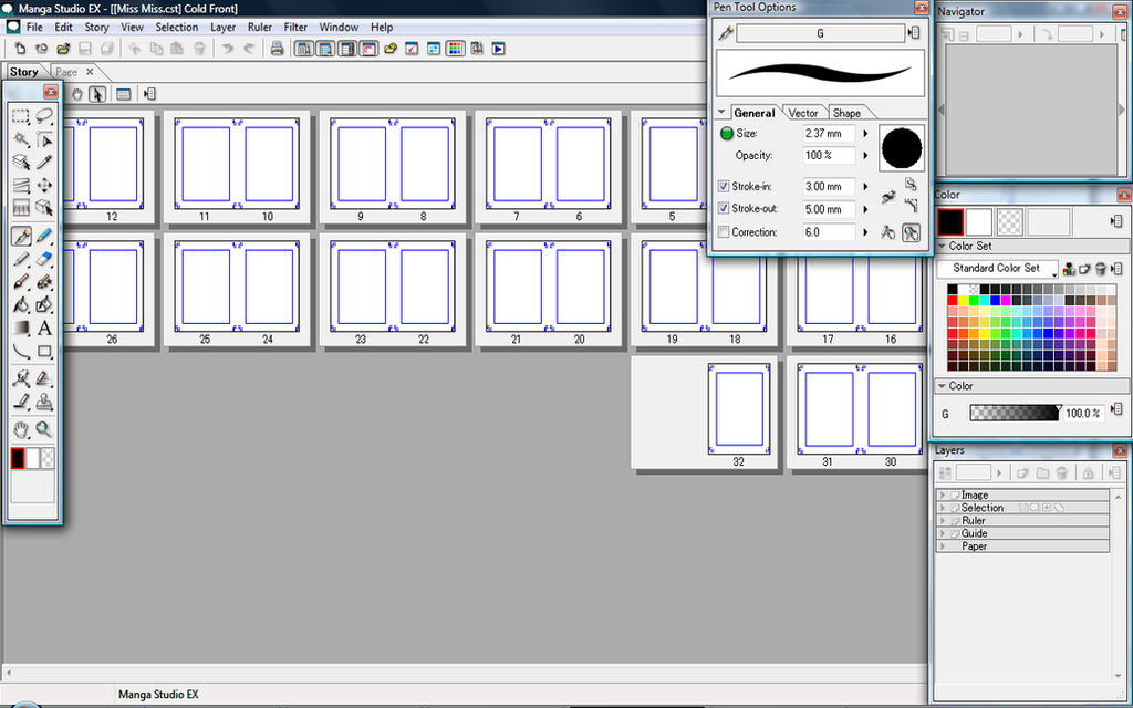
- I already have my story prepared but I will walk through it anyway. Go to File>> New Story and a dialogue box like below will appear. When it is open adjust your page bleed to what you need. I have mine set to double page spread since I find it easier to create a better flow and I love to make double page full spreads. The most important part however is if you are doing small panels you'll definitely want 1200dpi. This is a high resolution giving you a really wide range of dot sizes for your screentones. If you're doing a basic 4koma page however, 600dpi should be plenty. If you need to view this image larger simply click it for a bigger view.

- In the layers window LEFT click Ruler and two options will appear. Ruler layer or Panel Layer. Choose Panel layer. We want this so we can cut up our own custom panels and have each panel perfectly spaced and neat and also so we can draw within the box and not have to erase going over the edges.
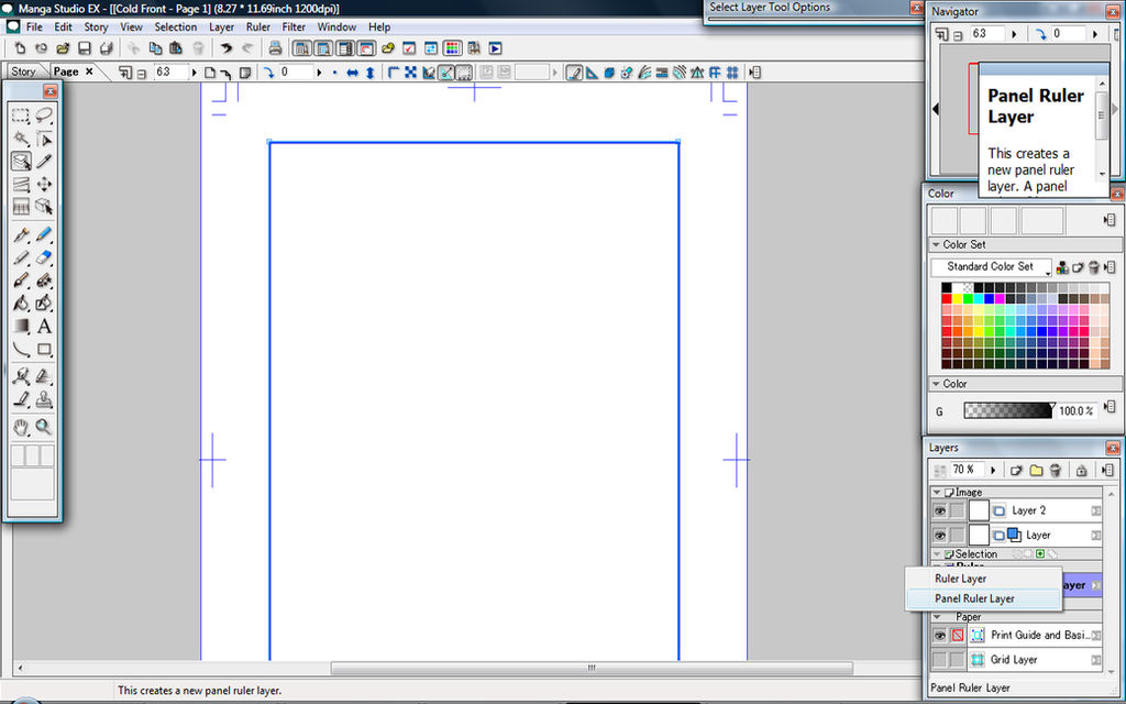
- Right click after you have cut up your panels and select Rasterize and when it asks to keep the original you must select yes otherwise your art won't be contained within the panels. At all times make sure your panel layer which you have rasterized is at the top as well to make sure this handy feature works. I'm making this my title page so I don't need to cut it up but below shows the tool used to create panels on the Panel Ruler Layer. I held and dragged to make the extra tools appear. The create panel and object selected help you to manipulate the panels that you create.

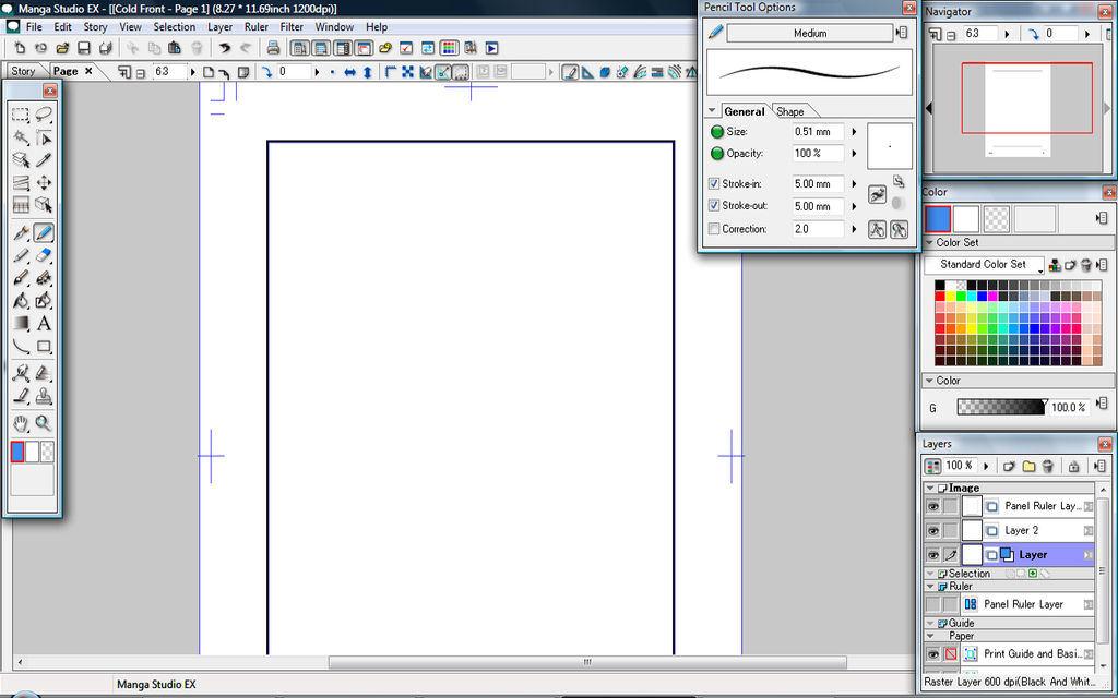
- Now for the sketching. Try to keep sketching on the premade sketch layer which is the layer called Layer, the defualt one for all new pages. With tool options open it is up to you but I turn off pen correction while I sketch and turn it on when I need it. To do this simply untick Correction. Also note that dragging on the circle or tiny dot in the small square window within the tool options is one way of changing the brush size. The other way is to use numbers but sometimes it's quicker to just drag and adjust within the window. Below is an image of my currect settings. For this sketch.
- With the sketch prepared click new layer and select Vector Layer. Make the vector black and white, give the layer a name if you like, I just called mine ink. Then use the pen tool, the one that looks like a calligraphy pen. Enable or make sure it is enabled, correction. I am setting mine to six. Do some test strokes and adjust to a setting that suits you. This will keep the lines crisp. In the image below I have two crossing over streaks, I am about to show you the most helpful features of vector layer.
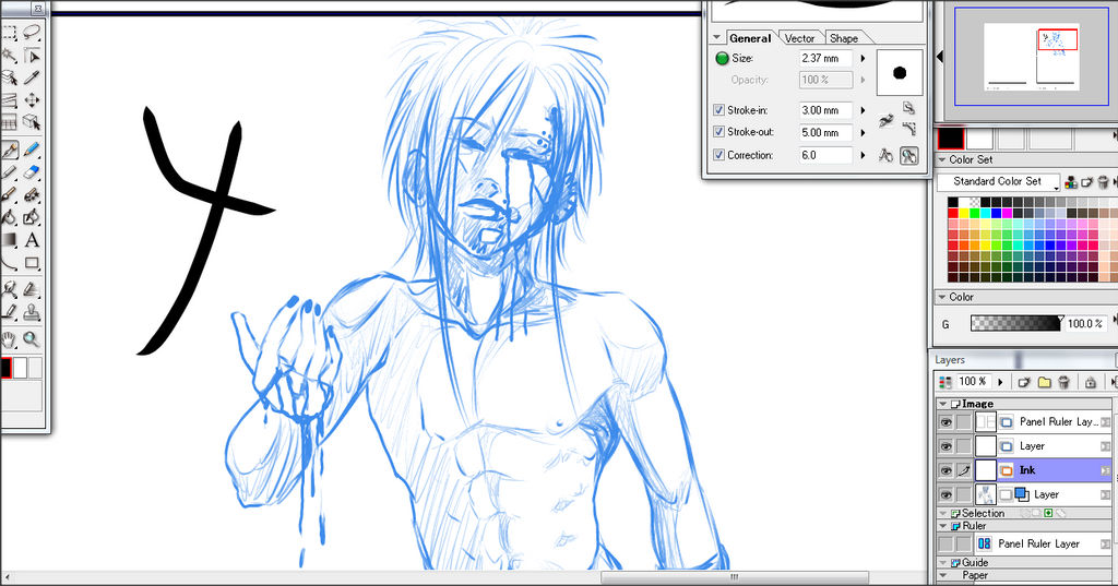
- Using the tool marked in the red circle you can use the little hand to pull and move and adjust your lines. While it is enabled and the tool options window is open you can choose other ways for this tool to behave. This is especially useful if you stroke is perfect yet out of line with your line art, you can simply move that one stroke over to where you like without disturbing the structure of your stroke.

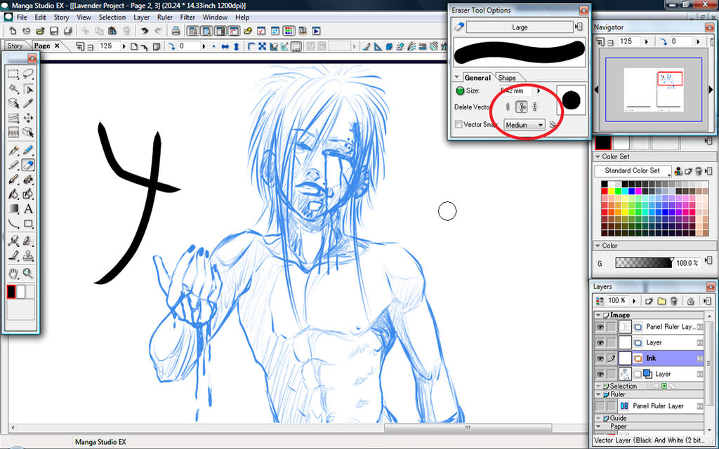
- The other useful feature is the eraser settings. You can set it to only erase the left over edges at a point so it becomes a perfect point or one entire stroke line without erasing the ones beneath it. The circle below shows these options. The first icon is normal erase. The second is to erase lines that have intersected and gone past each other. So the black line art I made I could simply click the stroke sticking out the side and the entire stroke on the outside would be erased leaving me with a "Y" shape and preserving the rest of the line art as is. I wouldn't have to erase it as close as possible like on regular raster layers. This can be extremely helpful when drawing buildings or hair or other line art requiring nice neat, clean and sharp edges. The last icon in the red circle deletes entire lines. If you have merely one stroke you wish to erase but to do so would mean redrawing it then vector layers have the advantage. If you draw all your line work on vector and this happens, simply select the last icon as displayed in the red circle, click the messy line and that line and only that line will disappear while the rest of the line art blow and above it will remain the same.
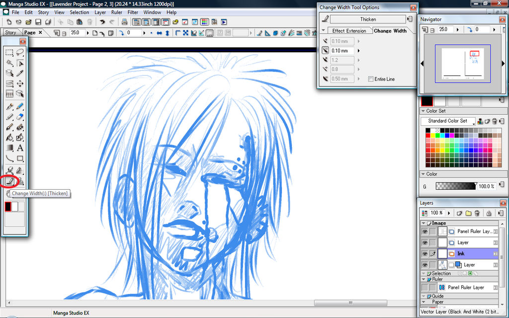
- The other vector tool that is very helpful is the line width adjustment tool. I marked it with a red circle below. In the tool options window you can choose to change the line with to thicker or thinner. When selected you do so by moving the tool over your strokes and it will look like a selection tool as it highlights the path you mark out and afterwards when you finish your stroke you will see the changes. Use the tool options window to adjust the strength of the tool as you use it. This is excellent for when you get those random lines that just don't match up like the others.
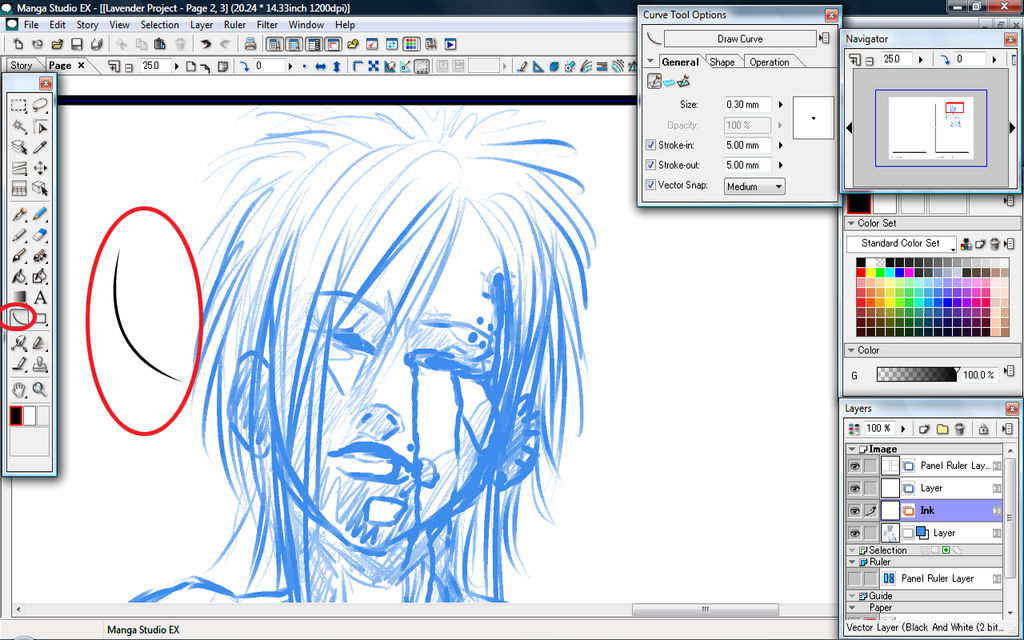
- The other tool which is easy to adjust with the tool shown in step 9, is the Curved line tool. It works on both layers but on vector layer it can be moved around, adjusted thickened or thinned. Again you can get other effects by using the tool options window. I set mine to stroke in and out 5mm which gave me the smooth thinning out ends. If I unticked these then I would have solid ends.
- Downside to vector layers, bucket fill doesn't work on vector layers, it only works on raster layers. Solution? Easy. Right click the vector layer when you are satisfied or finished with your line art. Select rasterize. When promoted to keep or discard the original layer select yes just incase you need to adjust or change it later. On the raster layer you can now use bucket fill for your black areas or colour them manually. Below shows the right click rasterize option.

- I have now finished my inking. It is ready for screentoning. There's multiple ways to screentone and I am going to show you 4 ways. The first one is using it like a pen tool. First go to window and enable the materials window as show below.
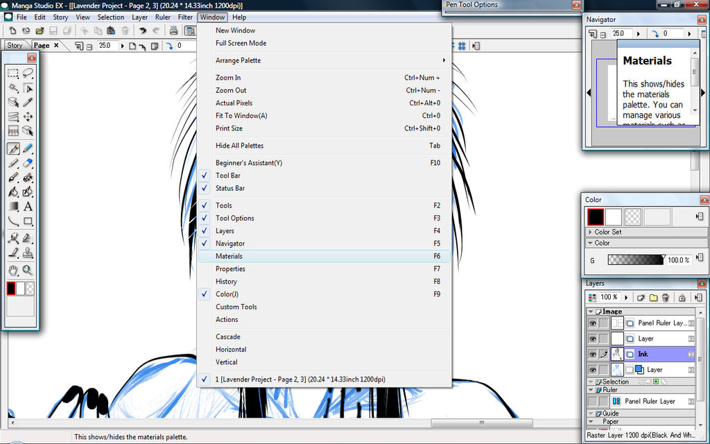
- Once it is opened you should see this window appear as shown below. Navigate the folders in this order. Tones>> Default >> Basic tone>> 1 screen>> 1 dot and find a suitable basic dot screentone. Before going any further please read the next step carefully.

- Double click the bar where it says materials to hide/shorten the window and move it out of the way. Below I have marked in red the mini preview of tones. Click this and your pen will go from black into to screentones. Everything you draw will now be in this dot format. To go back simply click the black. BEFORE YOU TONE go to the next step and read carefully otherwise your tones may not work to the best qaulity possible.
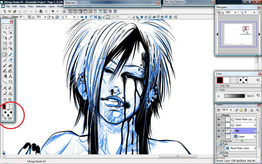
- With the area clicked from what was circled in red in step sixteen, click anywhere on the page and a new screentone layer will automatically be created. You can use this as a way to paint on screentones. When you complete you tones however, you MUST right click and rasterize otherwise when you export it will turn out as a flat grey colour instead of a screentone!
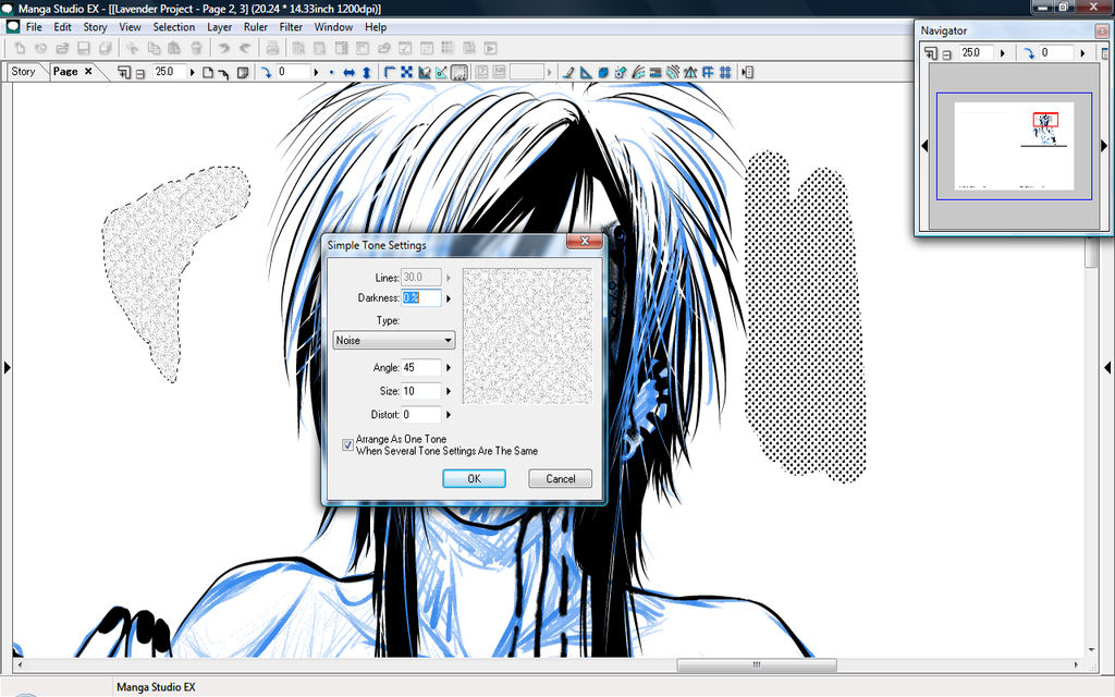
- Method 2: Before you screentone in this method create a new layer in this specific way in order for it to work. Click new layer, choose raster then change to 1200dpi. Next choose 8bit grey and then conver to tone. This is very important. This also will make sure all your colouring in grey scale is converted immediately to screentone. The image below shows all of these settings that I mentioned. Hit ok when it is done. On this layer you can colour in greys and it will be screentone but the defualt dot size will be quite small. To adjust this go to window>> Properties. Go to the next step to see how to alter the tones.
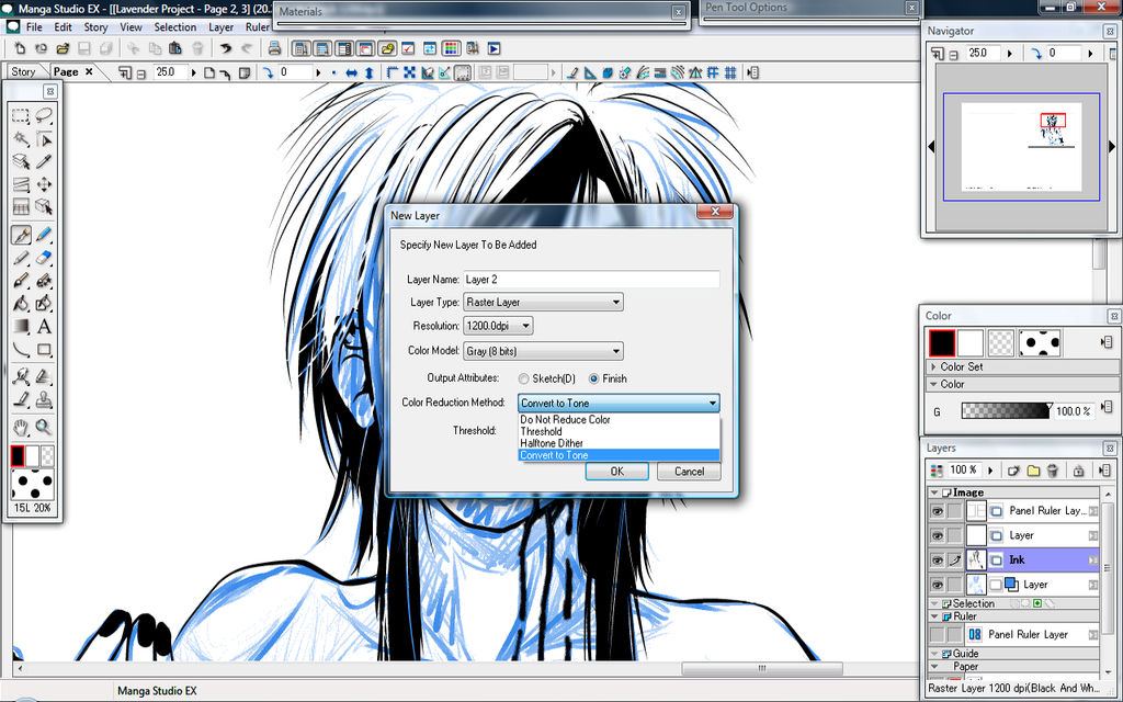
- Click the tone tab in properties and adjust the settings here. You can see the effects take place immediately. I recommend doing a test blob like I have done below before toning your areas. This method gives you the most control.

- Method 3: You can use the selection tool. First go to to view and enable Show Selection Launcher as shown below.

- Select the areas you wish to tone using the various selection tools or the selection layer if you know how to use them. Hold down the shift key to add selection areas or hold CTRL to minus areas. Next, click the last icon of the selection launcher as marked in red below.

- This dialogue box will now appear. This will give you multiple screentone options, from basic dots to material screentones to common textures. Preview them and choose the one most suited to your comic/manga. This is also the better method to use for screentoning clothing and concrete since it has the better controls over the lighting value. This is all I have to show you using this method.
- Method 4: Colour what you want toned in the rough lighting value that you need OR make a somewhat greyscale painting on a regular raster layer. Go to Filter>> 2DLT and a lot of options appear. This works better for 3D objects and greyscale photographs. It will line art and colour whatever you have there and break it down however you specify it to. It looks more complicated than it is. The multiple greys is basically like a cell shade version of gradient. Hit preview to preview and ok if you like it. Below is a screencap of the 2DTL dialogue menu. Personally I like method 2 and 3 to work with.

- All of this should help you to complete a manga page but I have one more helpful screentone tip to share. I'm going to show you how to manipulate screentones so that they look more realistic. In otherwords I am going to show you how to warp material screentones to move in the same direction as clothing and what not. Open up the materials panel once more. Navigate this way: Go to Default >> Basic Tone>> Design>> Pattern and select the first pattern or whatever you like really. Select your area where you want the tone to be manipulated over then drag and drop the tone material into this area use. Open the properties window if you have closed and adjust your screentone scale and dot size to what you need, Rasterize, then go to Edit >> Transform >> Mesh Edit as shown below. If it isn't rasterized then it won't work.
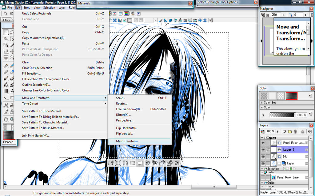
- A red grid will appear like what I have shown in my screen capture below. Manipulate your screentone using those points. Just remember to use or open Tool Options to adjust your mesh settings. The more segments means more lines and points you can use to manipulate the shape and appearance of your tone.

- Below I have moved my mesh points to show an example of what I am talking about. I increased my segments to six by six before I started. Below is how the mesh looks after I moved the points then the second image is how it looks after I hit ok. This is especially good if you want your tones to follow the flow of a curtain or dress.


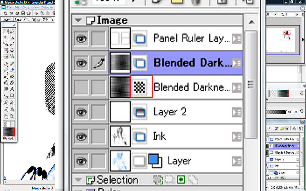
- Start neatening up your screetone layers by placing them in folders and naming them. This will help you from getting lost and confused. Then when you feel your page is complete and ready to export go and make sure all your tone layers have been rasterized. The tone layer will appear with dots like marked in the red box below. If you see it and it's not hidden then you haven't rasterized and kept the original. By default when rasterizing the tone layers and saying yes to keeping the original it is auto-hidden for you. Mine is hidden because it has been rasterized. The raster version is above it as you can see with the mini previews.
- To export to post on DA go to file>> Export Image (In pixels) This dialogue box will appear. For BEST results possible MAKE SURE the parts marked in red are set. Those are entire page, colour and PNG. Downsize your picture in something like photoshop or sai or GIMP to maintain quality but if you export in this way then it will look just as crisp as it does in manga studio and all the tones will appear correctly in their dot form and there shouldn't be any flat grey colouring unless you did that on purpose. If you didn't and there is a patch that is grey colouring instead of dot screentone then you have not rasterized a tone layer somewhere. Which mean you will have to go back through your layers and locate it.

- Of course don't forget to save in manga studio file format as well so you don't loose all your work
- ENJOY YOU'RE AMAZING CREATION!
And that is all I have to teach. This is just one of many many many ways that you can create a manga or comic in Manga Studio. Hopefully I have shown and explained enough methods to get some basic screentoning and inking completed. If you have questions please don't hesitate to ask. Below are some links to my other Manga Studio Tutorials.
Manga Studio EX 4 Walk Through Part 1Image Heavy! So if you have an old or slow PC this tutorial may not be for you. It may cause lag or a crash. Just so you know.
This tutorial set will cover text and how to do comic style wavy text with a white outline. Panels dones with the panel ruler so when you draw in the panel nothing goes outside said panel without the need for selection tool. Screentones, custom tones and other ways to tone. Inking if I get far enough. And 3D materials for setting up scenes.
FIRST STEP: MAKE YOUR DPI 1200!!! You can change those at any point using layers alone! I'll elaborate more later.
In the below image. Hide beginners mode. Open the Navigation window, Colour, Layers and Tool Options in the Window Tab.
Where I have marked red go to the tab called Rulers. Left click and the option shown will appear. Choose Panel Ruler Layer.
In the image below, use the two tools pointed to, to cut and adjust your panels.
Manga Studio Walkthrough: Part 2- 3DNot to be attempted if you have less than 2GB ram or your pc WILL crash. It's hard to run on the minimum requirements but it is possible.
Carring on from yesterdays tutorial with panelling.
In the panel you intend to use for you building or 3D object use the tool shown in the red square. Options will appear though I hid mine for now to show you what the 3D plane looks like. When you select the tool click and drag to the borders of your panel.
Now the properties panel will open for what you wish to put in this area. This can range from guns to motor bikes to housing and city scapes. The best part however is that you can build your OWN 3D objects to place in here. I'm going to show you how to arrange in perspective, change to line art only or line art and toning. Before I go on this is for any trolls:
I am not endorsing cutting corners or showing how to be lazy. Manga studio allows you to be a one artist team. This is go
Manga Studio: Why Are my tones showing up gray?[EDIT] An extension to this tutorial is right here on a blog I don't even use any more. This is how to change your export settings so you don't have this issue ever again! http://miwasketch.blog.fc2.com/blog-entry-13.html
I had this problem for so long and the solution is so very simple. So below is what you see while you work but you zoom in and you see tones. You export and it's still grey right? Well there's only one small step to do.
Go to the layers panel where the screentone layer is. Right click, go to rasterize and click. When it asks to keep original yes or no, select 'Yes' just in case you need to change the dot size. And you should then see this as a result and it should be the same when exporting.
I see this problem often on DA where everything else like materials is showing up screentone and the rest of the art seems to be greyscale painting and it looks odd. The s
Manga Studio Walkthrough: Part 3- Wavy Text- TextWavy text, speech bubbles, custom speech bubbles, outlined text. TEXT GALORE! Yes this one is covering Text 8D I always see that someone uses photoshop for wavy text even though manga studio can do it or they use photoshop for that white outline but in manga studio it's a matter of a click of a buttonI will show you how.
I will show you also how to auto screentone speech bubbles for that dark foreboding feeling.
Click on the text tool, it's the icon that looks like the letter A. Click on your art work in the panel area you wish to use text. The properties panel will appear as above. Where I have pointed out in red, tick for out line. Change the number up or down for the thickness of the white outline.
Tick and adjust the other options for other effects. Now for the speech bubble click where I marked in red the tab called Dialogue Balloon Settings.
Click generate Dialogue Balloon and a new window will appear
Super nova
All access to art on demand!
Fun, vibrant images to brighten up your day..
I hope you enjoy using my art for exciting new adventures.
$5/month
Might Return
It's just a maybe at this point. I left DA because I moved on to animation and it's to hard to post animations here. You can catch me livestreaming instead of posting art.
Car Crash Yesterday
Yesterday in my timezone was my birthday and we had a car accident. The car is totalled and of course we need a new one. I'm okay, everyone was okay, just an unfortunate accident. I would open commissions but past experiences has taught me it's ultimately pointless so I won't bother this time. I will also unlikely be around on DA much at all except to dump a bit of art and run. I am mostly active on Twitter and YouTube now or livestreaming rather than DA since it seems DA is pretty dead these days.
I don't know what we are going to do but hopefully something will work out.
After Commissions Taking A Break
A lot is going on in my life right now and after I finish up my commissions I will be going on a break.
Demonetized
With the new rules, my channel will be getting demonetized. So if you have issues with the ads, then please don't take it up with me anymore, email youtube. Even better, get an AdBlocker extension from the extensions store on google chrome or for firefox. There's plenty out there that block those annoying and unskippable ads.
© 2012 - 2024 DraconianRain
Comments82
Join the community to add your comment. Already a deviant? Log In
Does anyone know how to upload it? It won't work for me D: {Sorry if it was mentioned, I just read some of what I thought was important in it.}


